Thursday, May 10, 2018

FINAL | ANIMATION REEL

For the final in our Motion Graphic's class, we have been asked to make a reel of all our work from this class, and anything previous we found interesting and would like to include. While I have a lot of prior animation work, most of it was in very small video files that were pixelated, grainy, blurry and overall low quality. In order to avoid this happening, I only used work from this semester.

Please note I did include a selection of work from my Communication Design 2 class, which was an animation of a Public Service Announcement that I created it.

Please note the full animations were not included, but pieces of each work, usually the best parts. Each piece is labeled with programs used and type of animation, as seen in an example.

'

For some reason, when editing the pieces together, the girl animations came out choppy and blurry. I was not sure what to do about this, but wanted to have the final reel posted in time.

Show Package Project | Final


This is the final version of my project! Please note that I removed some of the blur effects from the last version and I changed some of the animations.

I think my biggest challenge with this project was time, and in the future I would like to return and make a more professional piece than what the final turned out to be.

Monday, April 30, 2018

Show Package Project | Progress and Update

Here is a video I made to represent my progress from 4/21. It has each of the pieces labeled at the stage they are at:


Since the above video, I have made significant progress. One thing I have done is practiced transitions. Using an after effects tutorial located on Youtube, I learned the process of creating transitions using alpha matte layers and the shape tool. Below is a video of my progress.

PRACTICING TRANSITIONS:


Finally, I worked on type treatments for my opening and completed it. In the rough draft below, you can see my completed opening, without the audio required for it. My final steps will be to add audio that fits to it and maybe some sound effects, such as a dog barking.


Wednesday, April 25, 2018

Show Package Project | Project Concept

This week, we have been asked two questions by my professor in which will define our project and introduce the concept we, as students, have been working on. We have been asked to include these two questions on our blog as our "project concept" as a way to continue to update our progress.

What is your show? I have decided that my show will be called "A Dog's Life." It is a narrative documentary, inspired by the dog kennel that my mom runs for a living. "A Dog's Life", if it was a real show, will follow the life a dog kennel and tell cute / sad stories that will appeal to the viewer. I see this being a show that would air on a non-fiction type network, such as national geographic, animal planet, tlc, etc.


What are the characteristics that you will aim to visualize and communicate to your audience? I believe that I want to convey characteristics of professionalism/seriousness, while also keeping a cute playful feel. The fonts that I chose will hopefully demonstrate the clear, focused, point of the documentary while the illustrations / color palette appeal to teens/young adults and keep the cute feelings in the documentary. I also hope that the graphics will appear as they are supposed too, aka, the scrolling banner looks professional and like an actual banner, not student work. 

Monday, April 16, 2018

Show Package Project | Styleframes + Elements

ELEMENTS:

~~~

BACKGROUNDS:

~~~

TYPE TREATMENTS:


Show Package Project | Storyboards

For the show package project, I created three separate storyboards. Each story board focuses on a separate part of the project, and has numerous treatments for the idea.

Lower Thirds:
(click the image to enlarge)

I played with the idea of many different things happening in the "lower third." I experimented with the idea of a bone falling into the page, but decided this would not be a proper banner. I also played with one similar to National Geographic's style. I played with the idea of having a paw print, but my professor asked me the question of the meaning of the pawprint. To her question, I came up with the idea of creating the documentary called "pawprint" as in, a documentation of how dogs leave their paw prints on us as humans. We also spoke about the idea of bone being on the left side instead of the right, so we do not have a weird open ended space if text is not long, ie, see the right bottom frame for the demonstration.

Background:
(click the image to enlarge)
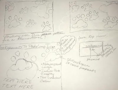
In the above storyboard, I have demonstrated what elements will be necessary for the background. I like the idea of the paw prints being left by a dog, and therefor that is how they will animate onto the screen. This background will be a huge starting point for where the photo comps and transitions will come for. The paw prints will move in this way and create limited space left over. For transitions / bumper, the paw prints could potentially enter and exit in the same way. For photo comps, the paw prints would enter the same way, but their will be intentional open space. A collage like image will enter, shake slightly, and then there will be room for the text for explanation.

Introduction / Title Opening:
(click image to enlarge)
The storyboard for the Title Opening was roughly drawn quickly. I have decided that their will be footage of puppies playing or dogs interacting with humans. The footage will fade to the blue screen, and then the paw print background will begin with minor adjustments. White cut out pictures to form a collage will appear on top, entering the same ways as paw prints and creating their own motion. From there, everything will exit the screen, the viewer will be left with one (1) singular paw print. The title will then enter from behind the paw print.
My only question is how to have the text organically enter around the paw print without being geometric and angular.


Sunday, April 15, 2018

Show Package Project | Inspiration and Visual Research

For this project, I have completed some visual research for documentary show openings, bumpers, lower thirds, ie.

Mentioned in a previous post, here is the commercial I created for my basic motion graphics class. It is a commercial for Pony Tails Kennel. I created this commercial with absolutely no experience, I was in my second semester of college.
I would love to use some of the elements from it for my project.


The following are images from a national geographic bumper. I believe this may be more of an opening for a national geographic documentary premiere. I tried to get images that would show the animation. I like the way the words come in from the left side of the square, and this could be emulated with a pawprint. https://vimeo.com/235266910
 

Here is an example of a student work lower third. This would be for a creepy style show. I like the simplicity used. There is not a lot of animation used here. https://www.youtube.com/watch?v=zWoTbM0r9GY

Here is another example of lower thirds. The youtube video includes many images behind the lower thirds with unique ways they could animate in. https://www.youtube.com/watch?v=RfkhFcAX1IY

Another example of student work. I loved the animation used in the example, and may try to emulate this. https://www.youtube.com/watch?v=rfjOWGFlBrs


Show Package Project | Project name and definition

Project Name: Show Project - Working Title

Definition: This project is to create a series of deliverable for a show of our choice. In class, we had the option to do documentary, award show, or entertainment/news. The project must include the following deliverables - an opening / show title, a transition (named Bumper), and graphics. The graphics include an animated lower third, animated full screens for photo comps/info slates, and a looping background. Unlike previous projects, are duration is depending on content / readability.

I have chosen to create a documentary style show project for a kennel website:

For a previous motion graphics class, I had chosen to create a commercial for Pony Tails Kennel. I will include my commercial under my inspiration post. During this time, the website was created using pink and green. We have sense chosen to create the website using blue and purple, so I will probably be focusing on using these colors. I also want to focus on creating dog bones, and paw prints for the imagery and background images.

Logo Project | Feedback + Styleframes

First, here is an update on style frames. These were meant to be posted with the storyboard.


Next, I wanted to describe some my feedback in detail that really shaped the final image produced for this piece. Everyone said that I needed to use KRL as my logo instead of the hand drawn style I tried to use. As a defense for myself, I chose to add the logo because my initial feedback said that I had not created a logo. I understand now I need to make KRL and Kyla Railey-Lowery more stylized to myself.

Another thing I want to work on is using fonts that follow a more professional style. I originally removed myself from the pink style because I was told it might seem more feminine and is not always something we associate with professionalism. I chose orange. Now, I am running into this problem with every font I choose. My projects are becoming too feminine or showing off too much of  wedding designer theme. I need to find a font that looks professional and cohesive to the many professions I am attempting to associate myself with.

Finally, the last thing I want to work on is creating small images in between the glitch effect. It was something my professor and I had spoken about previously and I believe if it had not been for time constraints I would have been able to figure out how to accomplish this effect. It's something I later want to work on.

Tuesday, April 10, 2018

Logo Project | Final


Effects used:
Displacement Map, Fast Box Blur, Colorama, Motion Tile

Reflection is created by creating a pre-comp that contains an image that is 3D and has a camera.

Monday, April 9, 2018

Logo Project | Rough Draft 3


This is not what I consider my final, but for the purpose of this project it is. I will be recreating and designing this for my final class reel.

Effects used:
Displacement Map, Fast Box Blur, Colorama, Motion Tile

Reflection is created by creating a comp with an image that is 3D and has a camera.

Monday, April 2, 2018

Logo Project | In Class Exercise

Here is progress on the logo creating a 3D Camera. Nothing seen in this exercise is going to be used for my final project. I just wanted to show my practice using the 3D camera during the in class work.


Note the sound is removed for this is just practice. I will consider camera angles in my final project.

Logo Project | Rough Draft 2


Here is a very rough draft of what I plan on doing for my logo for my demo reel.

Changes I am looking to include are possible images in the glitch, more work with the 3D camera, and an actual final logo I create in illustrator.

Monday, March 26, 2018

Logo Project | Rough Draft Practice from Class 1


Today in class, we worked on using effects to create our logo in order to have something to show. Upon experimentation of using a tutorial listed in my inspiration, I have creatively come up with a new idea that I will be using. My logo will now not be symbols, but will start with:

CARTOONING
GAMING
CODING
DESIGNING
KRL
 (krl is my initals)

Each word will glitch to the next text effect. I think it would be neat to have all these texts positioned in different places, almost like a 3D effect where my logo is scrolling through all the things I can do. I think this will really broadcast who I am as a designer and have strength. KRL will have a symbol next to it, maybe a kiss or a lollipop. I feel this newly designed logo really illustrates who I am as myself and as a person.

Sunday, March 25, 2018

Logo Project | Researching: Competition

In the process of creating my logo, I have been doing research on different logos that might be an influence. I have tried to find student work, professional logos, and etc.

https://www.youtube.com/playlist?list=PLpGbI6I9RXM559uC39S3HQd2rESUAyiXX is a playlist of tutorials and student work I found inspiring. Some of these, mainly the ones labeled Typography or About Me inspire me tremendously, and make me want to create something of the sort this week.

Here are some logos I found after researching. These are made by freelancers. Some are their actual logos, and some are logos they allow you to take and use. These are a huge inspiration in the type of logo I want to create.

I have found that each of these have a very specific style that caters to the look of their clientele, which is something I need to watch when creating my logo. While I want this logo to be a reference to myself, and who I am, I also want it to be something that will resonate with the public.

Logo Project | Logo Development

Original Sketches:
At the time, I was not sure if I wanted to use a former company (I created the name and planned on using it if I ever continued in the design / animation world) or if I wanted to use my social media presence that I network and post through. I have decided to use the kissxmekyla because I feel it will be the easiest to change if need be to match my own name, Kyla Railey-Lowery.

The final logo I will be working on is:


The logo will change from a lollipop, to a cat, to a kiss, very quickly, but long enough for the viewers eye to adjust. The kissxme will be a traced version of my own cursive, but KYLA will be written in a sans serif font. At the end, the final image will color glitch.

Logo Project | 3 Storyboards

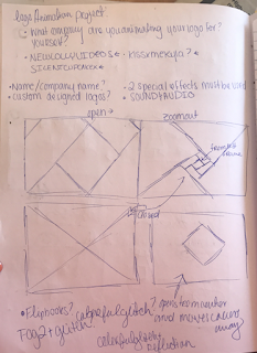
Here are some storyboards I created that execute the idea that I want to create.

Cloud Effect
(original idea, included glitch effect. I removed this idea after discovering that the cloud effect was not a royalty free source. I also decided the clouds did not have a reference to the logo itself and were unnecessary... they did not serve a purpose.)

Triangle Effect

Colored Glitch Effect
(seen at the bottom in two frames)

I have decided to use a morph effect into the glitch effect demonstrated in two frames.


Logo Project | Brainstorming + Inspiration


Name: Logo Project | kissxmekyla

Define / Include Animation Purpose: The project is to create a logo for ourselves that includes two special effects and sounds. I want to create something for the animation / freelance company I plan to have at some point or something for one of my accounts. I want this logo to be unique to me and use things that really define my personality and myself. I define this project as something that will help me brand myself for future to come. I've chosen to use my social media name kissxmekyla, because it may be something I eventually create for myself.

Brainstorming & Collecting: 
Trying to remember the purpose of the animation, I tried to brainstorm some ideas.
I created a playlist:
The playlist consists of different tutorials and inspiration that are interesting to me and have influence on what my logo may be.

Three separate ideas I have are located within this playlist. These are:
Cloud Effect

Triangle Effect

Colored Glitch Effect


(For a frame of reference, I have decided only to use one of these in my project, and that would be the colored glitch effect. Along with colored glitch, I will use morph.)


While I want my background to be girly, I want it to have a professional look that also appeals to designers and gamers. My background is in game design, which is what I received my associates in, so I want my logo to reflect a gaming and/or anime look.
Here are some examples I found online:


I felt that combining these two styles might help me to create the look I want to achieve.


Character Environment CANDYLAND | Final


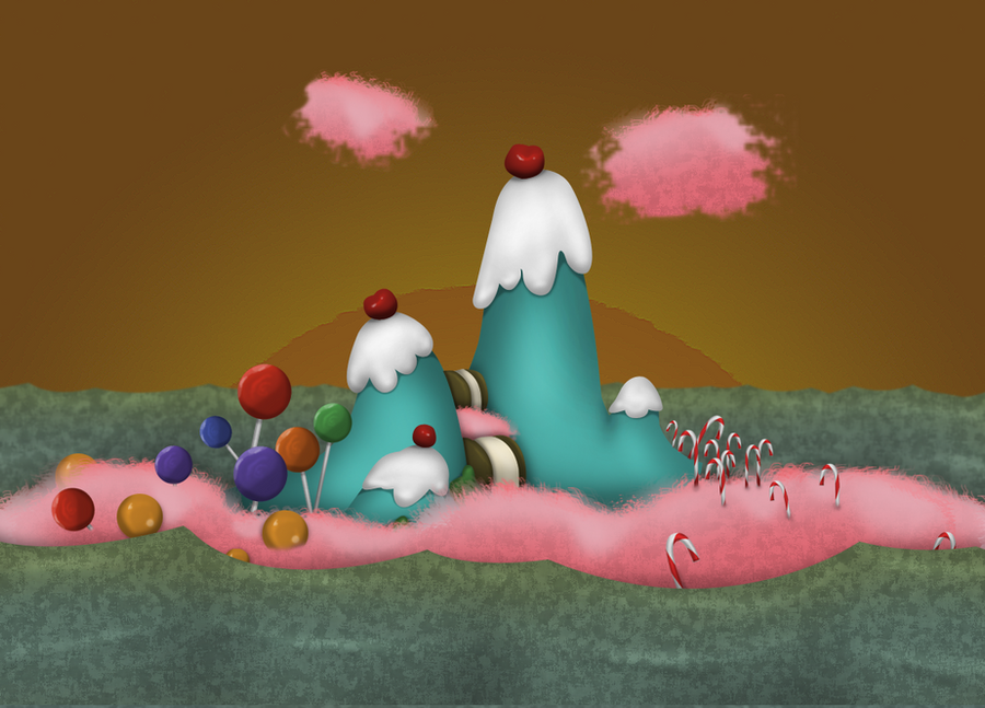
Here is the final Candyland scene using some updates taken from the feedback provided. The feedback can be seen in my previous blog post.

New features to the final include:
Gray Scale Girl which changes once retrieval of Candy
Candy Wrapper Sound
Slight Change in girls movement, including the way she walks in, and the jumping motions.

Character Animation | Project 2 Girl in the Candyland Scene

I have attempted to create a rough draft of the original girl within the Candyland scene. She does not fit at all along the pathway, so I removed it, but I did attempt to get her to pick up candy. Because her anchor points are wonky, there was not a lot I could do.

The girl in the scene also has had a little bit fixed. I fixed the speed of her left arm, and I fixed the way her right hand waved.


Saturday, March 24, 2018

Character Environment CANDYLAND | Storyboard + Development + Feedback


Development
The following is rough sketches done in a pen that was running out of ink and mechanical pencil. I attempted to use arrows to symbolize the motion that the girl would be creating. These arrows can be found in frames such as three and four to show basic motion.
  • For frame three, I describe the rocking movement, which is something I want to create when she lands too hard and cannot catch her balance.
  • For frame four, I use arrows and pencil lines to describe the bending of her torso when retrieving the candy. The arrow can also be seen duplicated in pencil in the close up.


Feedback
The feedback I received touched base on many different things. I broke them down into categories in order to provide myself with a better framework for the final.

Character The girl’s color blends in with the candy (as does the candy with background). She also blends into the background. When she pops up at the end, you do not notice the candy in her mouth. Also, she seemed very pixelated when shown large scale on the projector.
Solutions I am considering changing her to a gray scale and once she retrieves the candy to have her change to a full colored character. I will also work on finding a way to remove the pixilation in her. I am hoping that I will be able to do this since she was created in Photoshop, something different than what I usually do. The candy will change to be more saturated also, instead of the cotton candy color scheme as the rest of the document.

Movement The girl jumps fast but falls slow, which is the opposite of real time movement. The girl does not accurately follow the path and may need to be scaled down in order to fit the path. Finally, the girl DOES NOT walk at the beginning but slides in.
Solutions I need to add the key frames for the walk motion at the beginning of the animation. Also, I need to work on her sizing and timing of separate things.

Sound While sound was not added, it was discussed. Possible addition of background noise, candy wrapper sound. The noise will demonstrate what is happening.

Questions Some questions I received were: “What’s the purpose of the outline?” “Should the girl be black and white till she picks up the candy?” “Why is the most animated part currently when she picks up the candy?”


Monday, March 19, 2018

Character Environment CANDYLAND | Rough Draft

Watch here:


Character Environment CANDYLAND | Styleframes


The following are style frames for what I suspect the scene will look like. Read below each frame to learn more.

Candyland environment, illustrated in Adobe Illustrator based off a sketch. The idea is to have a beginning, middle, and foreground. (Orange grass, sign, candy canes / path, bushes, grass / mountains, sky, ground, tree / retrospectively)
Thick strokes to keep cartoon vibe.


The three girls scene in the video. They went through many stages. Sketches, to photoshop, to illustrator image trace, back to photoshop to be split for movement. The detail in the sketches was a little too heavy to trace with the simple pen tool, so this was my solution. Unfortunately, it does not translate as well in after effects as a monochromatic girl, so there will have to be another solution.

Sunday, March 18, 2018

Character Environment CANDYLAND | Collect

Inspiration

The following is a few scenes that gave me ideas for the type of scene I wanted to create. As mentioned in the previous blog post, I was inspired by the candy land board game design and the cartoon network style that my girl followed. Her colors of pink were also a huge inspiration to what I wanted to do with her, figuring pink reminded me of cotton candy.

Inspirations include:
Candied Island from Misadventures of Flapjack, Candy Land board game, and Chowder (show).
 

https://www.youtube.com/watch?v=r9hzxt8VKn4
https://www.youtube.com/watch?v=--oTQCysVTs


Tuesday, March 13, 2018

Character Environment | Beginning Solutions

Project Name: Candyland

Project Description: This is a combination of the new project and the last project, character animation. I am given the task to take my character from the last project, and create her environment. In this environment, she needs to interact with an object, which is something I left out last time. I also plan to give her a different movement, and her perfect some of the problems from last time.

Brainstorming:

I had many ideas for this project, and I am still brainstorming exactly what I want to do. I was originally inspired by the idea of her being a Korean pop singer, a K-Pop Star. I once took a sexy k-pop dance class while I was on a vacation, and it was definitely an inspiration behind how I originally built my character.

Unfortunately, I was unable to completely mimic many k-pop dance moves when creating my character. 

Because of this, my original idea for her environment was this sketch:
It was supposed to be her concert stage.

In a previous environment I had created for another class, I was taught to heavily rely on background, middle ground, and foreground, and I felt the concert stage did not have a lot of this, and was kind of flat.

I believe I will use photoshop and mesh some images together for this project.
I also believe I will have my character pick up a piece of candy.

Here's some image inspiration:


Friday, March 9, 2018

Character Animation | More Work


Here is some more work on my character animation based on some feedback I got. I worked on giving her a second expression, and I also gave her actual legs and feet. I slightly corrected some of her movement.

I will be using this same character for our next project, but I will be changing her animation to bend down, and possibly her facial expression.

I also got some feedback on this character. Some said her eyes seemed a little wonky. I will be working on this before the final environment scene is due.

Monday, March 5, 2018

Character Animation | [ROUGH] Storyboard + Notes

Here is an image that has my very rough storyboard, sketched horribly with notes all around of the ideas I want to create. I never created a storyboard directly of what I wanted the character to do. This storyboard was created long before the character was created, and I feel like it did not have the best direction. Notice their are mutliple ideas noted.


Character Animation | Collection of Inspiration

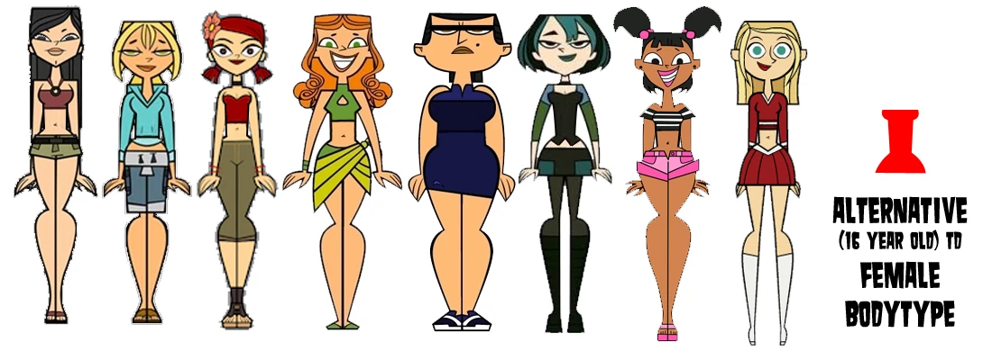
As I began designing my character, I looked at a lot of different inspiration, which can be seen below in this post. My character was very much based on a "lolita anime girl" even though she looks very cartoonized in an american style.

Here are some really basic sketches of girls that she was developed from. I feel like my drawings were not very clear and did not convey a lot of emotion.

Girl, Upper Body and Legs:

The legs for the girl were developed after the rough draft of my animation, and I plan on going back and adding them before turning in what I consider a final animation:

Original sketch of girl used mainly for some inspiration, pencil and water color pencil:
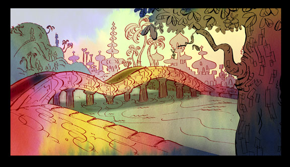
The following are some images of cartoon girls that heavily influenced her look.

INSPIRATION

(Style wise, not including legs): 

(Style wise, legs):


(Hair, limited to my drawing skills):


(Personality type):

Her animation was mainly based on my skills, and what I understood how to do. I did not base her on much other than a previous work of mine, which can be seen here: