Thursday, May 10, 2018

FINAL | ANIMATION REEL

For the final in our Motion Graphic's class, we have been asked to make a reel of all our work from this class, and anything previous we found interesting and would like to include. While I have a lot of prior animation work, most of it was in very small video files that were pixelated, grainy, blurry and overall low quality. In order to avoid this happening, I only used work from this semester.

Please note I did include a selection of work from my Communication Design 2 class, which was an animation of a Public Service Announcement that I created it.

Please note the full animations were not included, but pieces of each work, usually the best parts. Each piece is labeled with programs used and type of animation, as seen in an example.

'

For some reason, when editing the pieces together, the girl animations came out choppy and blurry. I was not sure what to do about this, but wanted to have the final reel posted in time.

Show Package Project | Final


This is the final version of my project! Please note that I removed some of the blur effects from the last version and I changed some of the animations.

I think my biggest challenge with this project was time, and in the future I would like to return and make a more professional piece than what the final turned out to be.

Monday, April 30, 2018

Show Package Project | Progress and Update

Here is a video I made to represent my progress from 4/21. It has each of the pieces labeled at the stage they are at:


Since the above video, I have made significant progress. One thing I have done is practiced transitions. Using an after effects tutorial located on Youtube, I learned the process of creating transitions using alpha matte layers and the shape tool. Below is a video of my progress.

PRACTICING TRANSITIONS:


Finally, I worked on type treatments for my opening and completed it. In the rough draft below, you can see my completed opening, without the audio required for it. My final steps will be to add audio that fits to it and maybe some sound effects, such as a dog barking.


Wednesday, April 25, 2018

Show Package Project | Project Concept

This week, we have been asked two questions by my professor in which will define our project and introduce the concept we, as students, have been working on. We have been asked to include these two questions on our blog as our "project concept" as a way to continue to update our progress.

What is your show? I have decided that my show will be called "A Dog's Life." It is a narrative documentary, inspired by the dog kennel that my mom runs for a living. "A Dog's Life", if it was a real show, will follow the life a dog kennel and tell cute / sad stories that will appeal to the viewer. I see this being a show that would air on a non-fiction type network, such as national geographic, animal planet, tlc, etc.


What are the characteristics that you will aim to visualize and communicate to your audience? I believe that I want to convey characteristics of professionalism/seriousness, while also keeping a cute playful feel. The fonts that I chose will hopefully demonstrate the clear, focused, point of the documentary while the illustrations / color palette appeal to teens/young adults and keep the cute feelings in the documentary. I also hope that the graphics will appear as they are supposed too, aka, the scrolling banner looks professional and like an actual banner, not student work. 

Monday, April 16, 2018

Show Package Project | Styleframes + Elements

ELEMENTS:

~~~

BACKGROUNDS:

~~~

TYPE TREATMENTS:


Show Package Project | Storyboards

For the show package project, I created three separate storyboards. Each story board focuses on a separate part of the project, and has numerous treatments for the idea.

Lower Thirds:
(click the image to enlarge)

I played with the idea of many different things happening in the "lower third." I experimented with the idea of a bone falling into the page, but decided this would not be a proper banner. I also played with one similar to National Geographic's style. I played with the idea of having a paw print, but my professor asked me the question of the meaning of the pawprint. To her question, I came up with the idea of creating the documentary called "pawprint" as in, a documentation of how dogs leave their paw prints on us as humans. We also spoke about the idea of bone being on the left side instead of the right, so we do not have a weird open ended space if text is not long, ie, see the right bottom frame for the demonstration.

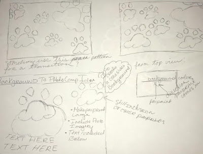
Background:
(click the image to enlarge)
In the above storyboard, I have demonstrated what elements will be necessary for the background. I like the idea of the paw prints being left by a dog, and therefor that is how they will animate onto the screen. This background will be a huge starting point for where the photo comps and transitions will come for. The paw prints will move in this way and create limited space left over. For transitions / bumper, the paw prints could potentially enter and exit in the same way. For photo comps, the paw prints would enter the same way, but their will be intentional open space. A collage like image will enter, shake slightly, and then there will be room for the text for explanation.

Introduction / Title Opening:
(click image to enlarge)
The storyboard for the Title Opening was roughly drawn quickly. I have decided that their will be footage of puppies playing or dogs interacting with humans. The footage will fade to the blue screen, and then the paw print background will begin with minor adjustments. White cut out pictures to form a collage will appear on top, entering the same ways as paw prints and creating their own motion. From there, everything will exit the screen, the viewer will be left with one (1) singular paw print. The title will then enter from behind the paw print.
My only question is how to have the text organically enter around the paw print without being geometric and angular.


Sunday, April 15, 2018

Show Package Project | Inspiration and Visual Research

For this project, I have completed some visual research for documentary show openings, bumpers, lower thirds, ie.

Mentioned in a previous post, here is the commercial I created for my basic motion graphics class. It is a commercial for Pony Tails Kennel. I created this commercial with absolutely no experience, I was in my second semester of college.
I would love to use some of the elements from it for my project.


The following are images from a national geographic bumper. I believe this may be more of an opening for a national geographic documentary premiere. I tried to get images that would show the animation. I like the way the words come in from the left side of the square, and this could be emulated with a pawprint. https://vimeo.com/235266910
 

Here is an example of a student work lower third. This would be for a creepy style show. I like the simplicity used. There is not a lot of animation used here. https://www.youtube.com/watch?v=zWoTbM0r9GY

Here is another example of lower thirds. The youtube video includes many images behind the lower thirds with unique ways they could animate in. https://www.youtube.com/watch?v=RfkhFcAX1IY

Another example of student work. I loved the animation used in the example, and may try to emulate this. https://www.youtube.com/watch?v=rfjOWGFlBrs