Showing posts with label Storyboard. Show all posts

Monday, April 16, 2018

Show Package Project | Styleframes + Elements

ELEMENTS:

~~~

BACKGROUNDS:

~~~

TYPE TREATMENTS:


Show Package Project | Storyboards

For the show package project, I created three separate storyboards. Each story board focuses on a separate part of the project, and has numerous treatments for the idea.

Lower Thirds:
(click the image to enlarge)

I played with the idea of many different things happening in the "lower third." I experimented with the idea of a bone falling into the page, but decided this would not be a proper banner. I also played with one similar to National Geographic's style. I played with the idea of having a paw print, but my professor asked me the question of the meaning of the pawprint. To her question, I came up with the idea of creating the documentary called "pawprint" as in, a documentation of how dogs leave their paw prints on us as humans. We also spoke about the idea of bone being on the left side instead of the right, so we do not have a weird open ended space if text is not long, ie, see the right bottom frame for the demonstration.

Background:
(click the image to enlarge)
In the above storyboard, I have demonstrated what elements will be necessary for the background. I like the idea of the paw prints being left by a dog, and therefor that is how they will animate onto the screen. This background will be a huge starting point for where the photo comps and transitions will come for. The paw prints will move in this way and create limited space left over. For transitions / bumper, the paw prints could potentially enter and exit in the same way. For photo comps, the paw prints would enter the same way, but their will be intentional open space. A collage like image will enter, shake slightly, and then there will be room for the text for explanation.

Introduction / Title Opening:
(click image to enlarge)
The storyboard for the Title Opening was roughly drawn quickly. I have decided that their will be footage of puppies playing or dogs interacting with humans. The footage will fade to the blue screen, and then the paw print background will begin with minor adjustments. White cut out pictures to form a collage will appear on top, entering the same ways as paw prints and creating their own motion. From there, everything will exit the screen, the viewer will be left with one (1) singular paw print. The title will then enter from behind the paw print.
My only question is how to have the text organically enter around the paw print without being geometric and angular.


Sunday, April 15, 2018

Logo Project | Feedback + Styleframes

First, here is an update on style frames. These were meant to be posted with the storyboard.


Next, I wanted to describe some my feedback in detail that really shaped the final image produced for this piece. Everyone said that I needed to use KRL as my logo instead of the hand drawn style I tried to use. As a defense for myself, I chose to add the logo because my initial feedback said that I had not created a logo. I understand now I need to make KRL and Kyla Railey-Lowery more stylized to myself.

Another thing I want to work on is using fonts that follow a more professional style. I originally removed myself from the pink style because I was told it might seem more feminine and is not always something we associate with professionalism. I chose orange. Now, I am running into this problem with every font I choose. My projects are becoming too feminine or showing off too much of  wedding designer theme. I need to find a font that looks professional and cohesive to the many professions I am attempting to associate myself with.

Finally, the last thing I want to work on is creating small images in between the glitch effect. It was something my professor and I had spoken about previously and I believe if it had not been for time constraints I would have been able to figure out how to accomplish this effect. It's something I later want to work on.

Sunday, March 25, 2018

Logo Project | Logo Development

Original Sketches:
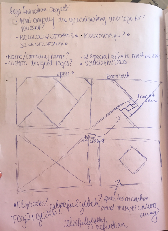
At the time, I was not sure if I wanted to use a former company (I created the name and planned on using it if I ever continued in the design / animation world) or if I wanted to use my social media presence that I network and post through. I have decided to use the kissxmekyla because I feel it will be the easiest to change if need be to match my own name, Kyla Railey-Lowery.

The final logo I will be working on is:


The logo will change from a lollipop, to a cat, to a kiss, very quickly, but long enough for the viewers eye to adjust. The kissxme will be a traced version of my own cursive, but KYLA will be written in a sans serif font. At the end, the final image will color glitch.

Logo Project | 3 Storyboards

Here are some storyboards I created that execute the idea that I want to create.

Cloud Effect
(original idea, included glitch effect. I removed this idea after discovering that the cloud effect was not a royalty free source. I also decided the clouds did not have a reference to the logo itself and were unnecessary... they did not serve a purpose.)

Triangle Effect

Colored Glitch Effect
(seen at the bottom in two frames)

I have decided to use a morph effect into the glitch effect demonstrated in two frames.


Saturday, March 24, 2018

Character Environment CANDYLAND | Storyboard + Development + Feedback


Development
The following is rough sketches done in a pen that was running out of ink and mechanical pencil. I attempted to use arrows to symbolize the motion that the girl would be creating. These arrows can be found in frames such as three and four to show basic motion.
  • For frame three, I describe the rocking movement, which is something I want to create when she lands too hard and cannot catch her balance.
  • For frame four, I use arrows and pencil lines to describe the bending of her torso when retrieving the candy. The arrow can also be seen duplicated in pencil in the close up.


Feedback
The feedback I received touched base on many different things. I broke them down into categories in order to provide myself with a better framework for the final.

Character The girl’s color blends in with the candy (as does the candy with background). She also blends into the background. When she pops up at the end, you do not notice the candy in her mouth. Also, she seemed very pixelated when shown large scale on the projector.
Solutions I am considering changing her to a gray scale and once she retrieves the candy to have her change to a full colored character. I will also work on finding a way to remove the pixilation in her. I am hoping that I will be able to do this since she was created in Photoshop, something different than what I usually do. The candy will change to be more saturated also, instead of the cotton candy color scheme as the rest of the document.

Movement The girl jumps fast but falls slow, which is the opposite of real time movement. The girl does not accurately follow the path and may need to be scaled down in order to fit the path. Finally, the girl DOES NOT walk at the beginning but slides in.
Solutions I need to add the key frames for the walk motion at the beginning of the animation. Also, I need to work on her sizing and timing of separate things.

Sound While sound was not added, it was discussed. Possible addition of background noise, candy wrapper sound. The noise will demonstrate what is happening.

Questions Some questions I received were: “What’s the purpose of the outline?” “Should the girl be black and white till she picks up the candy?” “Why is the most animated part currently when she picks up the candy?”


Monday, March 19, 2018

Character Environment CANDYLAND | Styleframes


The following are style frames for what I suspect the scene will look like. Read below each frame to learn more.

Candyland environment, illustrated in Adobe Illustrator based off a sketch. The idea is to have a beginning, middle, and foreground. (Orange grass, sign, candy canes / path, bushes, grass / mountains, sky, ground, tree / retrospectively)
Thick strokes to keep cartoon vibe.


The three girls scene in the video. They went through many stages. Sketches, to photoshop, to illustrator image trace, back to photoshop to be split for movement. The detail in the sketches was a little too heavy to trace with the simple pen tool, so this was my solution. Unfortunately, it does not translate as well in after effects as a monochromatic girl, so there will have to be another solution.

Monday, March 5, 2018

Character Animation | [ROUGH] Storyboard + Notes

Here is an image that has my very rough storyboard, sketched horribly with notes all around of the ideas I want to create. I never created a storyboard directly of what I wanted the character to do. This storyboard was created long before the character was created, and I feel like it did not have the best direction. Notice their are mutliple ideas noted.


Character Animation | Collection of Inspiration

As I began designing my character, I looked at a lot of different inspiration, which can be seen below in this post. My character was very much based on a "lolita anime girl" even though she looks very cartoonized in an american style.

Here are some really basic sketches of girls that she was developed from. I feel like my drawings were not very clear and did not convey a lot of emotion.

Girl, Upper Body and Legs:

The legs for the girl were developed after the rough draft of my animation, and I plan on going back and adding them before turning in what I consider a final animation:

Original sketch of girl used mainly for some inspiration, pencil and water color pencil:

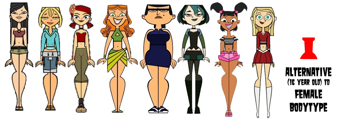
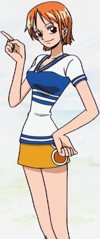
The following are some images of cartoon girls that heavily influenced her look.

INSPIRATION

(Style wise, not including legs): 

(Style wise, legs):


(Hair, limited to my drawing skills):


(Personality type):

Her animation was mainly based on my skills, and what I understood how to do. I did not base her on much other than a previous work of mine, which can be seen here:


Sunday, March 4, 2018

Cultural Myth Stop Motion | Update + Feedback

I wanted to add a quick update to the posts added earlier on about my Stop motion. I realized I had never added any of my inspiration, ideation, or definition, besides the mindmap posted early. I wanted to include extra processes to really explain where I was coming from.

Defining the assignment in my own words: 
I had felt that this assignment was to make a stop motion out of something we all believe in but don't really always address as something incorrect. My biggest step in understanding the assignment was relating it to celebrities, where we believe they have all these things they really do not. I used that as my biggest definition of the project.

Ideate:  I feel most of our ideation is done in one of my earlier blog posts. Our mind map was a huge inspiration behind where are idea for the project came from.

Collect: Michaela, my partner for this assignment, showed me some great examples of stopmotion unlike anything I had ever seen. This was similar to one of the things she showed me:


https://www.yelldesign.com/our-work/papermeal/

We really liked how they used paper ingredients and still created a food like dish. It was a big inspiration behind the idea of a stop motion that used food.

This is one of the specific examples: https://www.youtube.com/watch?v=qBjLW5_dGAM

We almost considered copying the aestetic completely we enjoyed the stopmotion so much. This stopmotion by PES is very well made and also very aestethically pleasing to watch, which was also something we were going for.

Styleframes: I thought these had been added in a post, but it looks like the post never got published and got deleted. During the process, Michaela and I spent a lot of time on call and messaging to discuss things. These are two images heavily discussed about whether or not we liked the project. Both are included here as styleframes, and really show the true idea behind our stop motion. (seen above)

Feedback: I never talked about the feedback that had been shared about our project. We did not receive a lot of what I consider "hearty" feedback, real feedback to help us. We did hear a little bit about timing from classmates, critique on our cookies. I think the biggest problem was something I had really outlined before, and that is the inconsistent lighting and not choosing a good time to film. We could also work a bit harder on clarity of the message.

Monday, February 12, 2018

Cultural Myth Stop Motion | Storyboard


Here is a list of ingredients:
  • Sugar - Equality
  • Butter - Possesions
  • Vanilla - Sunshine
  • Egg - Friendships
  • Baking Soda - Education
  • Water - Exploration
  • Salt - Spirituality
  • Chocolate - Love


Monday, February 5, 2018

Cultural Myth Stop Motion | Styleframes & Narrative


I tried to symbolize something within the style frames. Unfortunately, we had agreed upon using my partner's kitchen for the set up, so I did not have specific things. I chose to take pictures of eggs because those were items that did not change. This was supposed to show that the style was normal pictures. I used two different lightnings to describe whether there would be artificial light or just overhead light.

AGAIN, the point was to show that the style would be ordinary camera style frames.

We decided are narrative would proceed as follows - first, we would write out happiness in the flour, spread across the counter. Then, we would mix everything into one bowl, dumping the bowl on top of the happiness. We would kneed it so far into the dough that the happiness would be gone. Then, we would bake the cookie.

We have mentioned before that each ingredient will have a label. We have decided we will label directly on the ingredients. A list of ingredients symbolism will be included in my next post along with my storyboard.